 |
相關閱讀 |
供獨立游戲開發者參考的2D美工教程(一)
 |
>>> 技術話題—商業文明的嶄新時代 >>> | 簡體 傳統 |
作者:Chris Hildenbrand
引言
對大多數獨立游戲開發者來說,自己親自解決美術設計的工作是必然的——可能是因為財政預算上的限制,或根本就沒有財政預算,許多年輕的獨立游戲從業者雇不起專門的美工或外包美術設計。
幸虧我們還有大量的免費軟件,如 gimp、 inkscape、 truespace、daz studio 和 vue pioneer 等(在此只列舉幾款),再加上基本能理解美術創意,幾乎人人都能制作出驚艷又專業的作品。
首先,我將帶領大家做幾個基礎的練習,以鞏固對美術設計的理解。所有練習用到的都是免費軟件。操作流程與 Adobe Illustrator、 Adobe PhotoShop和 CorelDraw等軟件相似。我會告訴你們如何運用這些軟件。因為美術創作軟件和技術太多了,所以我沒有辦法面面俱道,不過我盡量保證以下練習用的都是你所選擇的軟件吧。
在開始我們的教程以前,我先澄清幾個觀點:
1、“我需要昂貴的軟件工具才能制作出真正專業的游戲美術設計。”
錯,不需要!現有大把免費軟件供你選擇。如果說Blender是3D領域的王道,那么Gimp就是2D世界的霸主。對于全職美工來說,把工具升級至“行業標準”還是有道理的,特別是與其他使用標準文件格式的人合作時,因為那樣可以使交接美術設計工作更容易。
2、“有了昂貴的工具,美術制作自然就會更好。”
錯,不會。只有美工才能讓作品更好。即使手頭上只有一支筆一張紙,優秀的美工也會能做出了不起的設計;最高級的工具也需要優秀的美工來操作才能產生佳作。
3、“我不懂美術,我連簡筆畫者不會。”
錯,你行。這就是現代計算機的意義所在,讓沒有美術設計資格證書的人也能制作出強悍的游戲美術效果。
4、“我的游戲本身就很好了,不需要美術設計了。”
好吧,你可以這么說。現在的獨立游戲市場還在速度擴張著,人們對它的關注也比過去多了。要讓你的游戲在眾多競爭者中脫穎而出,你的游戲應該“全面發展”——玩法要有趣,畫面和音效也不能落后。
共同的阻礙
期望過高:
獨立游戲開發者面臨的共同問題之一是,對自己期望過高。對于勢單力薄的個人開發者或小工作室,不要妄想制作出大工作室才有能做出來的AAA游戲。你確實應該朝大師級的方向努力,這正是獨立游戲制作的奧義。盡力而為,堅持不懈,超越自我……但你得現實一點,根據自己的能力和預算調整自己的期望,這是走向成功的重要一步。
確定重點:
許多時候,游戲創意來源于一個靈感的火花。我們只是想到游戲的可能運作方式,就著手制作。一開始,游戲制作過程很順利,但隨著開發深入,問題會漸漸暴露出來。所以,從美術設計入手游戲開發并不適合,應該先確定游戲引擎/核心玩法。一旦確定了游戲玩法,要想出適合整個游戲的視覺效果就非常容易了。
一致性:
為了產生良好的游戲體驗,畫面的在視覺和感覺上的一致性是非常重要的。從圖標、啟動畫面到游戲屏幕,都必須保持一致。
最常見的錯誤是:
字體太多——游戲UI的字體控制在2到3種足矣(除非字體是以圖片的形式用于表示商店/包裝等)。
反差強烈——保持畫面處于接近的水平,你可以采用色彩過渡——從開頭到BOSS戰/史詩場景,色彩越來越豐富。
特效——好是好,但許多“美工”認為特效使用得越多,畫面會……我的建議是節制地使用個把特效,盡量重復利用或調整變量。
光照——看你的屏幕,想象一下產生高光所需的光源、游戲內物品/UI元素的陰影……嚇著了吧,相同屏幕上的物品總是被打上隨機的光影。
焦點缺失:
看到你的美術設計與游戲玩法和代碼一樣精彩,你非常容易陷入得意忘形之中。我們總是把關注重點放在自己喜歡的元素上,而忽略了那些我們不感興趣的部分。例如,菜單系統和UI通常是被我們冷落的對象。這些元素往往是游戲開發的最后階段才補上的,而那時候,制作人員的積極性都不太高。然而,這些卻是最先映入玩家眼簾的東西,會極大地影響玩家對游戲的看法和感覺。
教程
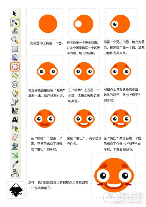
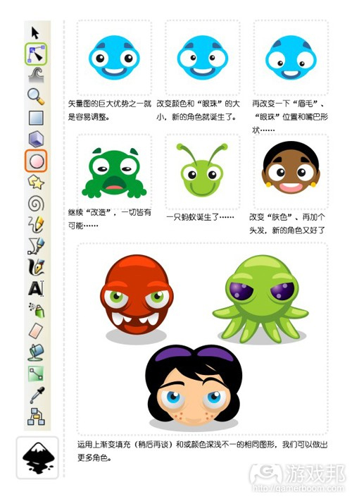
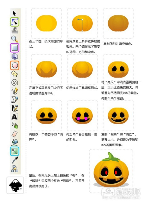
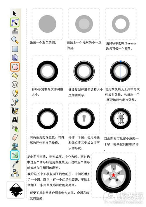
第一個教程是在inkscape上完成的,主要用到圓形工具(在工具條中用橙色框標出)和錨點工具(綠色框標出)。
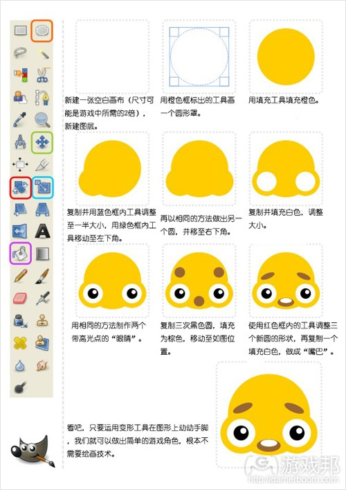
使用位圖工具(游戲邦注:如gimp中的圓形)可以制作出相似的圖案。操作流程稍有不同,不過只要你保存不同圖層上的元素,移動、改變和調整都很簡單。
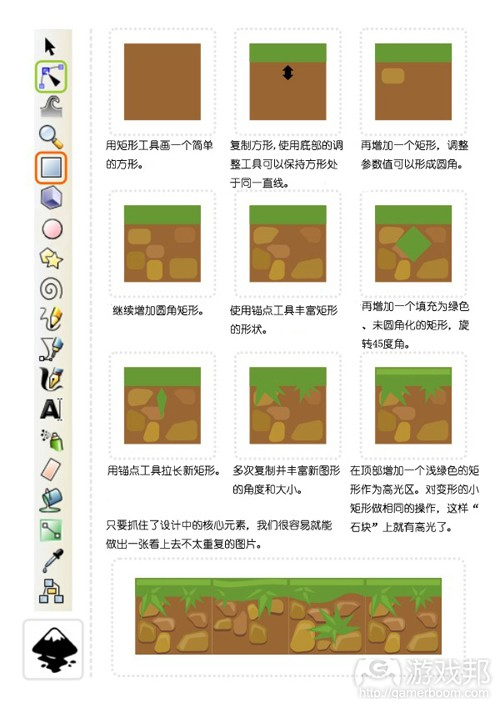
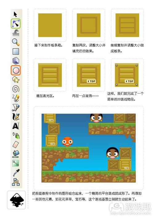
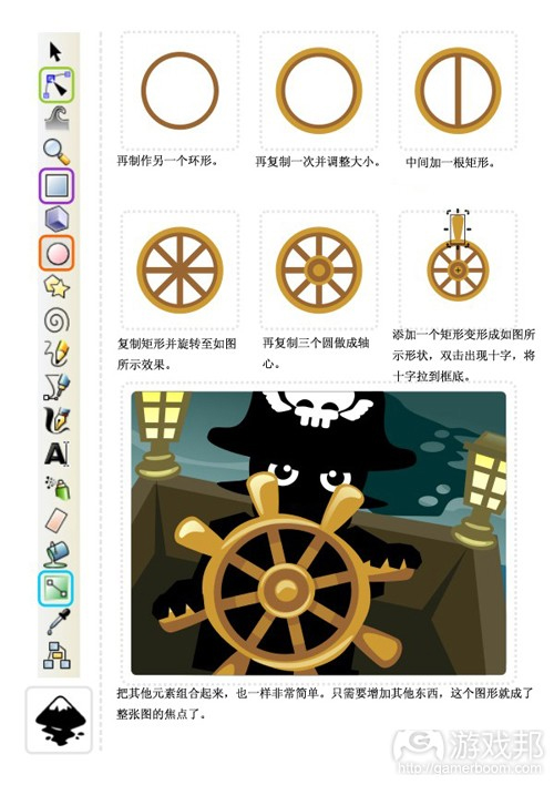
接下來的教程和上面的差不多,這回使用的是矩形工具:
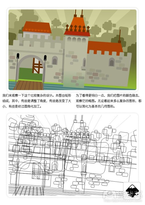
這幅圖的概略圖看起來有些亂,但從中我們可以發現,這整幅圖都是由矩形和變形的矩形組成的。
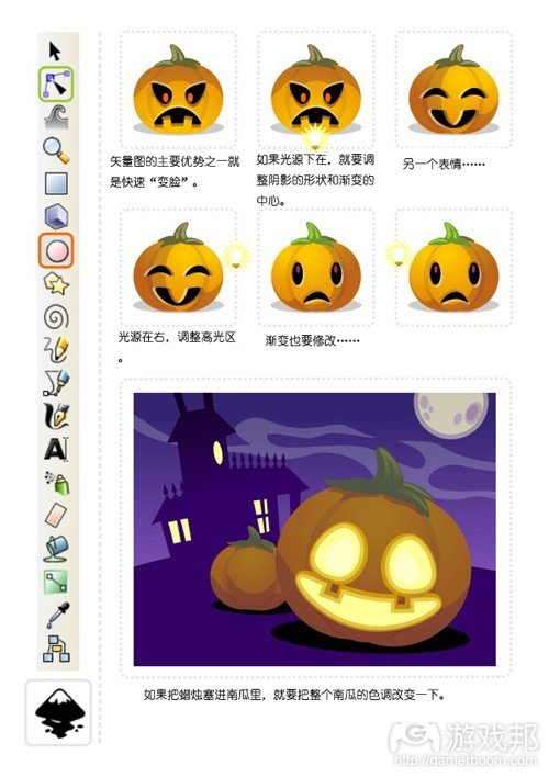
漸變填充是一個非常有用的工具。我們來看看下面這個教程:
下次我們將綜合運用Union、Intersection、Exclusion、Difference和Division來制作更復雜的圖形。
但愿讀者們能自己嘗試著制作與教程類似的圖案,從中發現inkscape、gimp等軟件的樂趣。(本文為游戲邦/gamerboom.com編譯,拒絕任何不保留版權的轉載,如需轉載請聯系:游戲邦)
2D Game Art For Programmers – Part 1 [updated]
by Chris Hildenbrand
Introduction:
Creating your own art work is a necessity for most independent developers. Due to the budget restraints or in a lot of cases the complete lack of a budget a lot of young indie game developer can’t afford to hire an artist or buy art assets.
With the help of free software like gimp, inkscape, truespace, daz studio and vue pioneer (just to mention a few) combined with a basic understanding of art creation pretty much anyone can create impressive and professional looking results.
I will try to start with some basic ideas and exercises to improve this kind of understanding. All of the examples will be based on free software. The workflow will be similar if you work with different software like Adobe Illustrator, Adobe PhotoShop, CorelDraw or others. I will try to mention the different approaches for those software packages. With the vast variety of software available at the moment and the sheer endless amount of our art creation tools and techniques it is impossible to cover everything but I will try to keep my examples basic enough to work with the software of your choice.
Let me start by clarifying some common believes when it comes to creating game at.
“I need expensive software tools to create truly professional game art.”
No, you don’t! There is a huge amount of free tools available that offer a true alternative. Gimp is one of the most well-known examples in the 2D realm as well as Blender in 3D field.
For the full time game artist upgrading your tools to ‘ industry standards’ makes sense. Especially when collaborating with others using standard file format makes sharing and exchanging art a lot easier.
“Buying an expensive tool will automatically create better art.”
No, it won’t. It’s always the artist creating the art that makes it great. Given the simplest tools like pen and paper a good artist can still create stunning pieces, while the most sophisticated tools still need a good artist to create something special.
“I can’t do art. I can’t even draw a stick figure.”
Yes, you can. This is where modern computers to come in and allow you to create good game art without having a graphic arts degree.
“My game is good as it is. I don’t need art.”
Yes, you do. The independent game market is getting larger and larger and is attracting a lot more attention than it used to a few years back. In order to stand out your game should be the whole deal – have a great game play as well as rewarding and consistent visuals and matching sound and music.
Common hurdles
High Expectations:
One of the main problems facing independent developers are the expectations they have themselves. For single developers or small studios it is close to impossible to create AAA games match the quality of big studios. You should try and aim for the stars. Making games is all about that. Do the best you can and constantly push your limits and improve your skills…
but thinking realistically and adjusting your expectations to your abilities and your budget is a big step towards creating the best game you can create.
Defining a theme:
A lot of the time game creation happens with a spark. We have an idea of how the game playing might work and start creating. Creating very concrete in game art in the early stages of development can often lead to problems as the game evolves during development.
It usually helps to create a working game engine/ core gameplay before starting on the actual art work. Once you know how the game plays it’s a lot easier to find a visual theme that encompasses the whole game.
Consistency:
Creating a consistent look and feel is a key element in creating a good gaming experience. It starts with the icon, the splash screen and goes all the way through to the game over screen. The most common mistakes are:
- the overuse of fonts – stick to 2 or 3 for the whole game UI [unless the font is used in images as lettering for shops/ packaging/ etc.]
- drastic changes in light and contrast – keep screens on a similar level – you can progress through the colour realm – usually starting out less colourful and getting more colourful for boss/ epic scenes
- photoshop effects – they are fun but a lot of ‘artist’ think the more you use the better the image will be… My suggestion is limit your use of fx to a few and keep reusing and variating them
- lighting – look at your screens and imagine the light sources needed to create the highlights, shadows of your ingame/ ui elements… It’s scary how often you find lights being randomly used for objects that appear on the same screen
Losing focus:
It is only easy to get carried away with your art work as well as game play or coding. We all tend to focus on those elements we like to do while neglecting those we don’t. A good example is generally the menu system/ UI. These usually are implemented at a late stage in the development with motivation at a low point. Yet they are one of the first things the player gets to see and they can greatly define the look and feel of the game.
Let’s get started
The first tutorial is based on inkscape using mainly the circle tool [marked in orange in the tool bar on the left] and the nodes tool [marked in green].
A very similar result can be created in a bitmap tool [e.g. using circle shapes in gimp]. The work flow is a little different but as long as you keep elements on different layers it’s easy to move, alter and modify.
The second tutorial works the same way – this time using squares:
The outline version still looks somewhat messy but it shows that the whole scene is made up of nothing but squares and deformed rectangles.
One very useful tool is the gradient fill. Let’s have a look at it in the next tutorial:
Next we are moving on to more complex shapes with the help of combined shapes using union, intersection, difference, exclusion and division.
Let’s take the gradient fill to the next level and work with colour and alpha to create a simple underwater background.
Hint:
Use the ‘Page Up’ and ‘Page Down’ key to adjust the order of objects [e.g. place the sea anemones in the mid ground behind the light rays.]
I would like to add more life to the underwater scene and create some fish. The basic principle when adding ‘real’ elements to a vector scene is to look at the shapes and ‘deconstruct’ them into basic elements like the circle, square, rectangle or ellipse.
I usually do a quick google image search for a reference image to get a better idea what I am going to create. In this case the ‘yellow reef fish’ search came up with a nice yellow longnose butterfly fish.
It works great as the main body is kind of squarish and the front has a triangular shape.
The same approach works the same with far more complex elements. It’s a matter of seeing the ‘building blocks’.
This concludes the first post. I hope you have fun trying to recreate some of the tutorials yourself or just play around with inkscape, gimp & co.
…and please let me know what you think about the tutorials, tell me what you would like to see featured or would like me to change.(source:gamasutra)
Chris Hildenbrand 2011-10-27 06:22:16
評論集
暫無評論。
稱謂:
内容:
返回列表
